Native Reporting
Artera's first in-product analytics surface.
At a glance
Reporting at Artera lived in Looker, which meant customers had to leave the product to act on their own data. As sole designer I shipped Native Reporting from research to GA between February and October 2024. I picked chart.js over Highcharts, Recharts, Nivo, Visx, ECharts, and raw d3, partnered with a principal engineer to reface it against Pacemaker tokens and WCAG AA contrast, and defined the Home Dashboard and Analytics Bites patterns the rest of the platform's reporting surfaces inherit. The chart-library reface made every other reporting surface cheap.
Context
Artera is the patient communication platform used across many of the largest health systems in the US. Reporting lived in Looker for years, which meant customers could get to their data and then had to leave the product to act on it.
By early 2024 the largest health systems were asking for a native analytics surface inside Artera, with communication outcomes, campaign performance, and operational metrics sitting next to the workflows the answers were supposed to change.
The problem
Looker did its job as a data-warehouse front-end. It was not where health systems ran their day. Admins left Artera to find a number, reoriented inside Looker, and translated what they saw back into decisions about campaigns, templates, and staffing. Each admin paid that context switch dozens of times a week.
The customers I talked to framed the request the same way. They did not want a dashboarding tool. They wanted a small set of clear answers about message deliverability, campaign response, and staff workload, visible where they already worked.
Research
I pulled telemetry on the heaviest Looker viewers and built the discovery list off it, then layered on customer segments I wanted represented so the surface would not over-fit to one user shape. Both groups asked for the same three things: message deliverability, campaign response, staff workload. The problem reframed from "port Looker into the product" to "design the smallest useful analytics surface Artera can own."
That reframe shaped every downstream decision. A port would have produced a second analytics tool to maintain alongside Looker, which customers would still leave Artera to use for the long-tail questions a port could not answer.
Design approach
I was the sole designer end to end. The first hard call was the chart library. I evaluated chart.js, Highcharts, Recharts, Nivo, Visx, ECharts, and raw d3 against accessibility defaults, theming control, performance under our largest customer dataset shapes, and how cheaply a non-charting engineer could ship a new visualization. I picked chart.js. It was not the most powerful option in the set. A product engineer could land a new chart in chart.js without a charting specialist on the squad.
I partnered with a principal engineer to reface the library against Pacemaker tokens and WCAG AA contrast. We treated the refaced library as a design-system primitive other surfaces could consume, not a one-off reporting-page treatment.
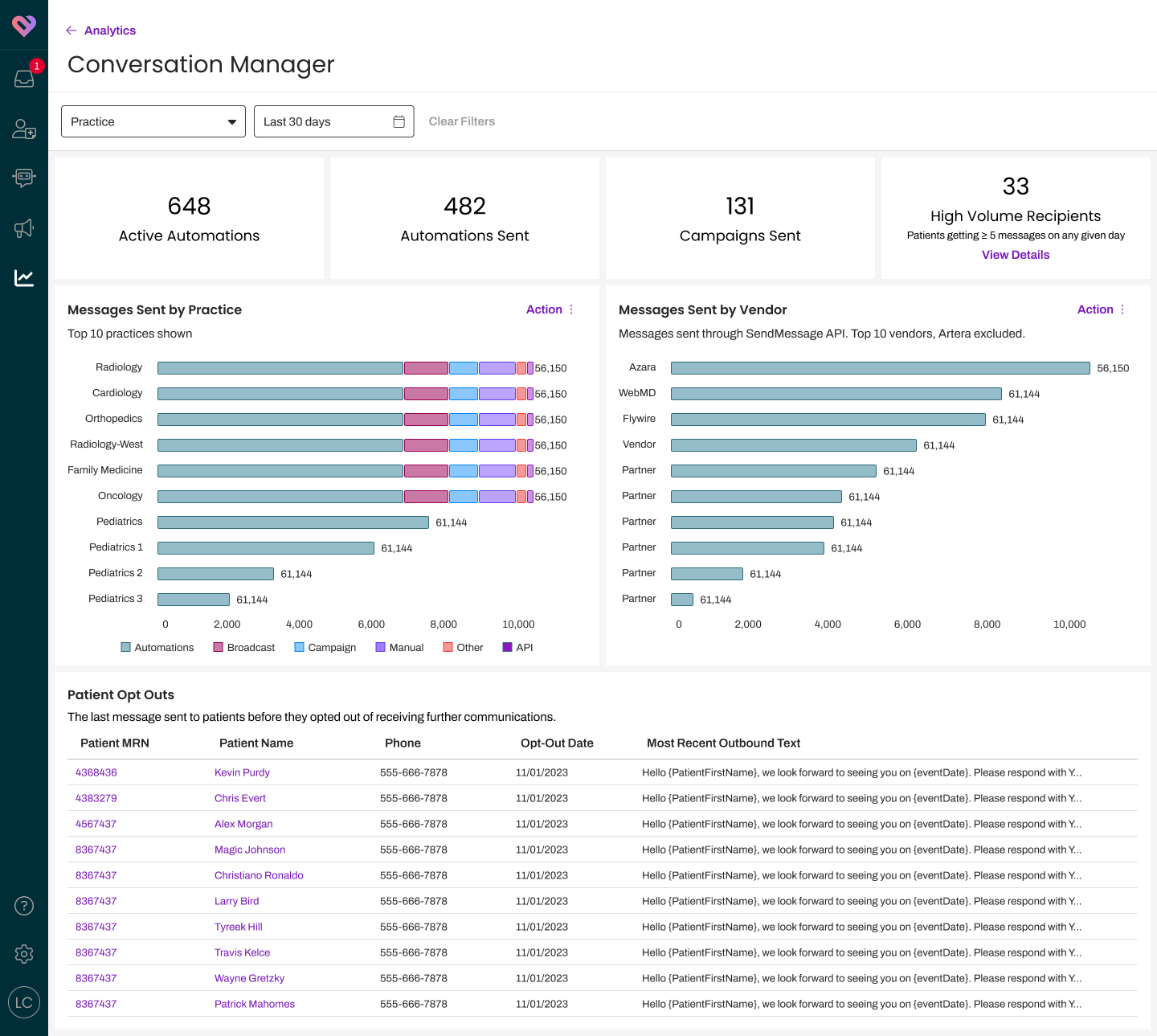
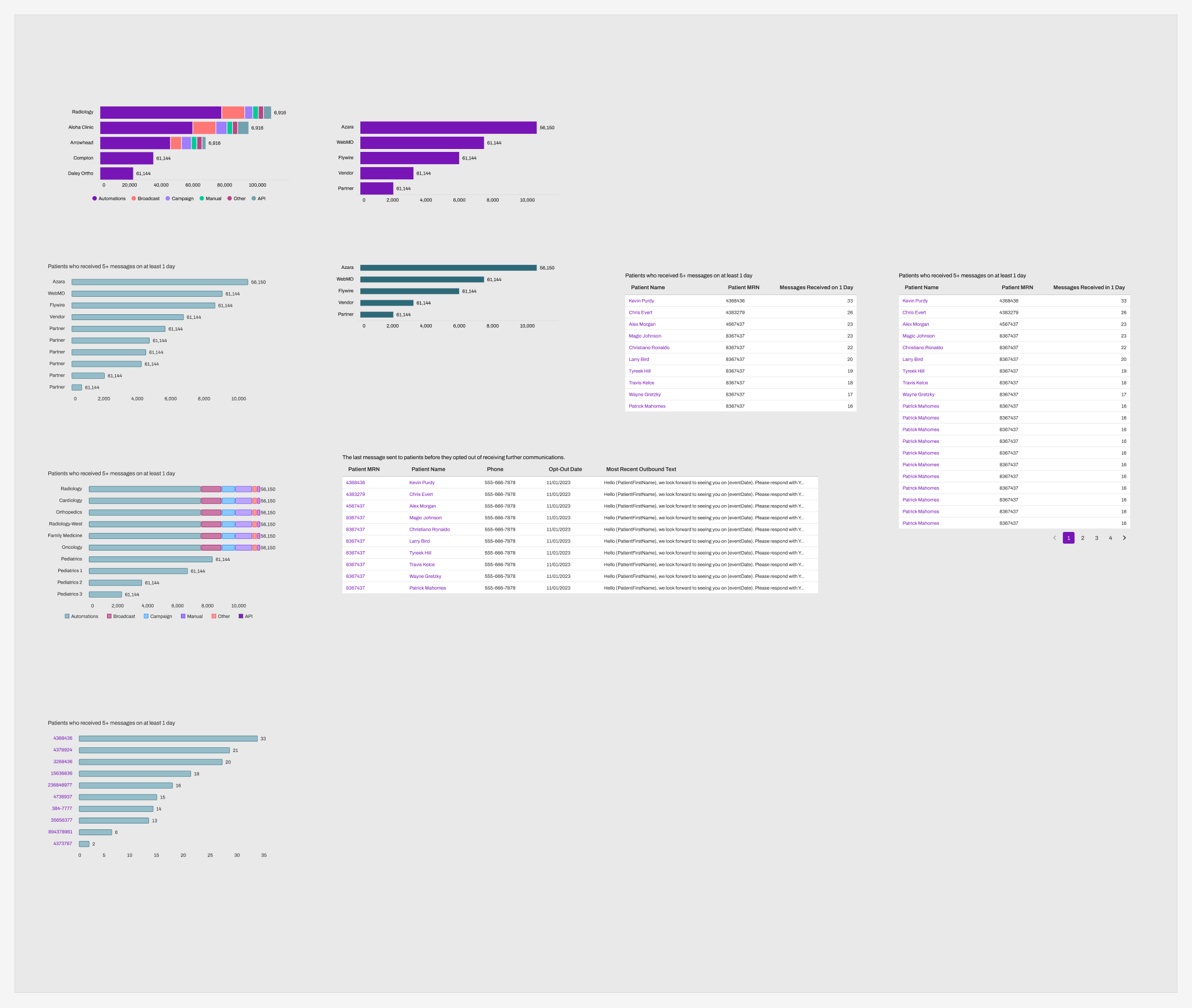
On top of that foundation I defined two patterns. The Home Dashboard gave each customer a shaped landing view of their most important metrics. Analytics Bites were smaller, embeddable analytics units designed to drop into workflows across the product, not just the reporting page. Bites mattered more than the Home Dashboard because Bites compose into surfaces outside the reporting page (Conversation Builder, Communication Manager), where the Home Dashboard does not.
Beta and GA
Beta launched in August 2024 to a segmented cohort: enterprise admins who already engaged with embedded reports and had EHR or SMS-API integration usage in production. We ran the beta with active opt-in, Pendo-driven onboarding (interest, you-are-live, feature-introduction), and rolling improvements shipped against real use rather than a fixed scope.
GA followed October 15, 2024. The rollout was not clean. A handful of production incidents inside the first month traced to split-flag interactions with the Channel domain (I have the count in incident logs and would rather cite it precisely than round). I worked engineering through each one and kept the beta cohort informed while remediation shipped. Each incident traced back to flag-interaction coverage gaps, not to the reporting surface itself.
What the bets were and what they cost
Porting Looker would have shipped faster and produced a second analytics tool to maintain forever. The customers I asked confirmed they would still leave Artera for Looker on the long-tail questions a port could not answer, so a port would have shipped a parallel tool that did not close the loop it was meant to close.
Highcharts, ECharts, and a hand-rolled d3 layer all beat chart.js on ceiling. None of them beat it on the criterion I was actually optimizing for, which was the next chart on the next surface, landed by a product engineer without a specialist seat. The accessibility reface against Pacemaker tokens was the work that made the lower-ceiling library safe to standardize on. Eighteen months past GA, no analytics-surface chart shape has hit a chart.js limit, which is the ceiling test the library selection lives or dies by.
Constraining the surface to the smallest useful analytics layer Artera could own kept the Analytics Bites pattern legible to engineering and to other designers. A bigger surface would have collapsed Bites back into reporting-page chrome, and the reuse across Conversation Builder reporting, the Communication Manager dashboard, and the reporting UI kit would not have shipped.
Outcomes
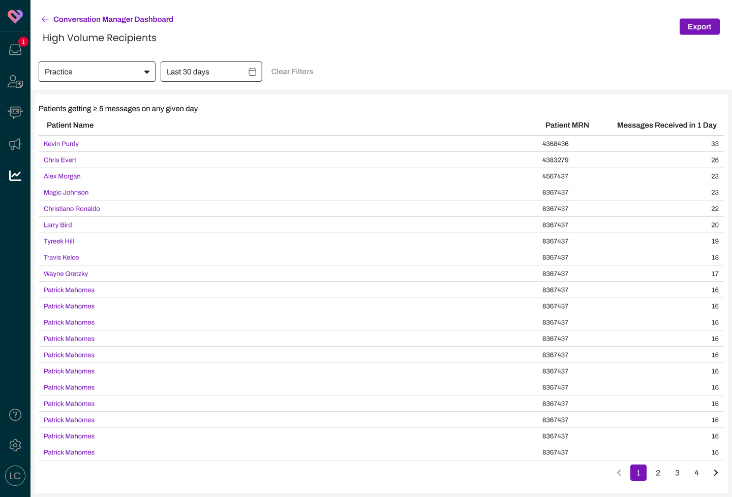
716 of roughly 980 enterprise customer organizations have used the Home Dashboard since launch, about 73% of the install base. (The denominator floats inside a narrow band because the enterprise org count moves quarter to quarter with new sales and consolidations; 980 is the number I trust at the time of writing.) Engagement is captured via Pendo events on Bite interaction, with 438 to 521 distinct organizations interacting in a typical month through 2025 and 2026. The Practice Filter Bite has logged 141,052 interactions on its own and is the tile customers reach for first.
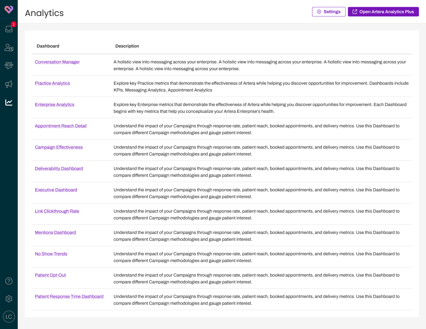
Native Reporting shipped as Artera's first in-product analytics surface and is now a standard part of the platform. Conversation Builder reporting picked up Analytics Bites in the same release window. New analytics work across the platform consumes the refaced chart library.
What I would do differently
I scoped the cross-domain testing of the rollout flags too narrowly. The split-flag and Channel domain interactions that bit us in the first month after GA were avoidable with a tighter pre-launch matrix. The cost was a month of incident-response engineering time and customer-trust capital we spent keeping the beta cohort informed.
I did not name a single owner of post-GA expansion. The "MVP complete, beta in progress" framing held in standups longer than it should have, which let the surface keep growing without anyone deciding when smallest-useful-surface discipline ended. Naming an explicit owner of expansion scope at GA would have surfaced the next-bet decision instead of letting the surface drift.
I should have logged a baseline page-view metric at GA. The Pendo coverage I have today gives me distinct-organization counts and feature interactions, and not a clean weekly active count on the surface as a whole. A page-level Pendo event wired at GA would have given me a clean weekly-active count from day one instead of the distinct-org-month proxy I report today.
Status
Home Dashboard and Analytics Bites remain the patterns. New analytics work consumes the refaced chart library. The 73% adoption figure is eighteen months past GA and still trending up as new enterprise customers onboard.