Reporting creating a new way to run financials


Project Description

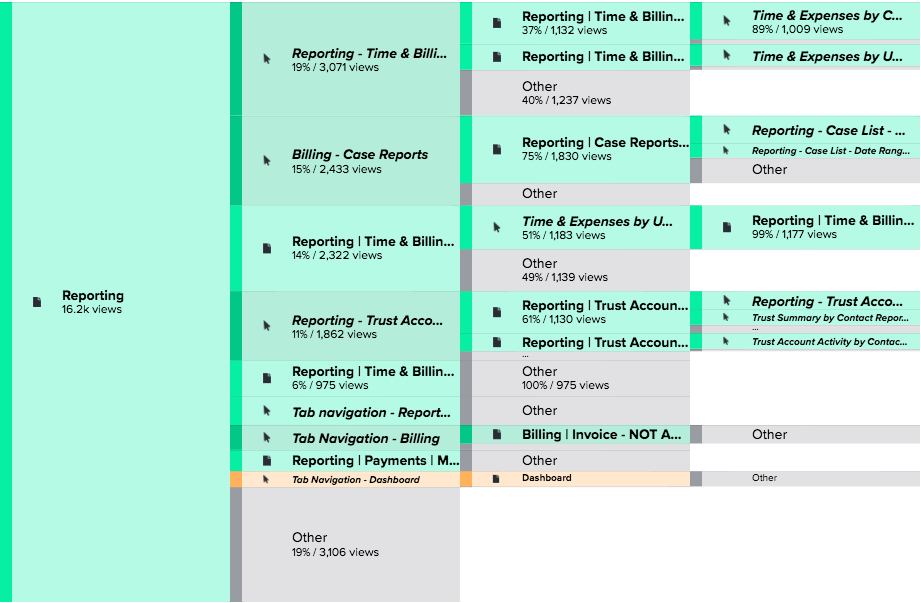
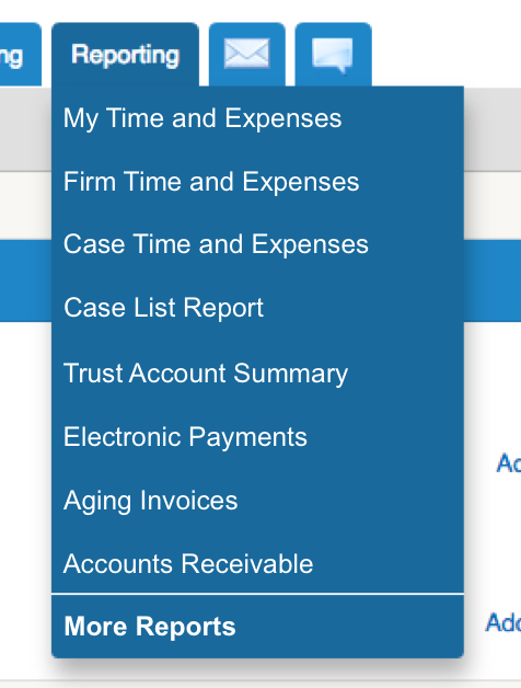
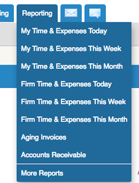
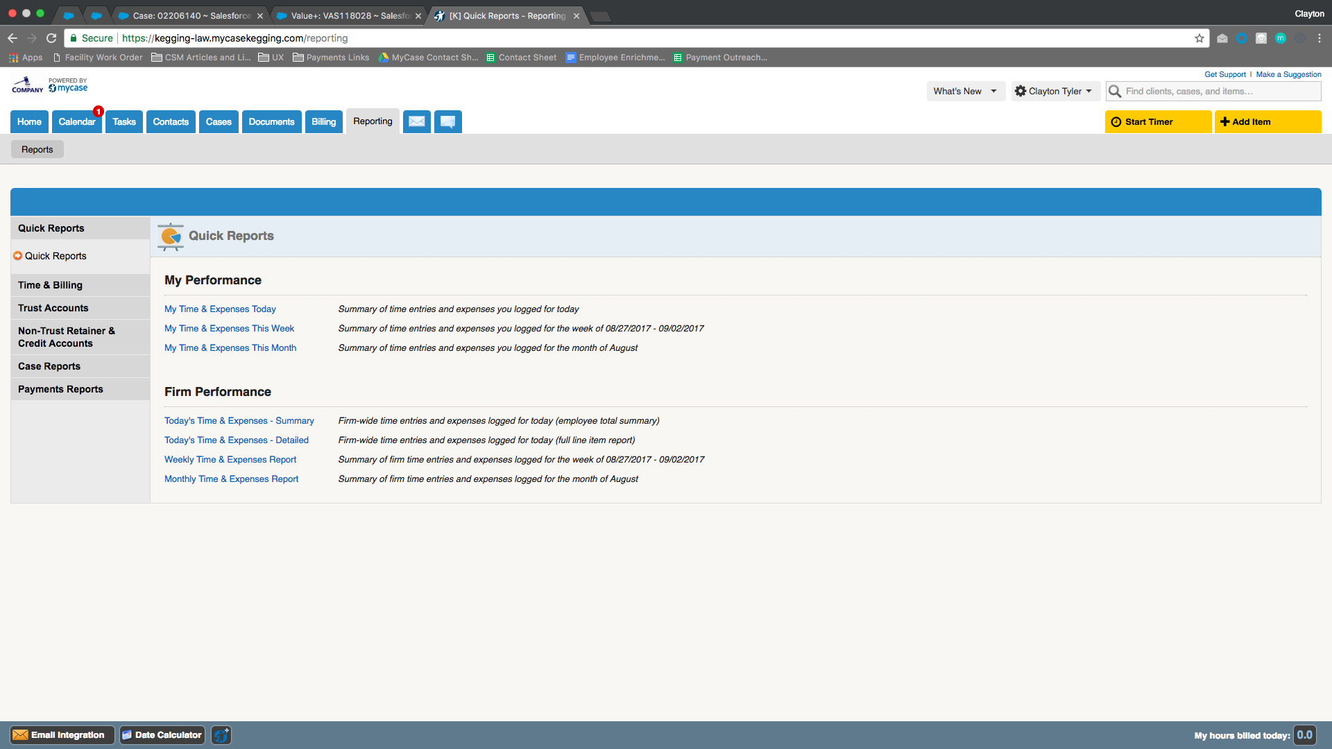
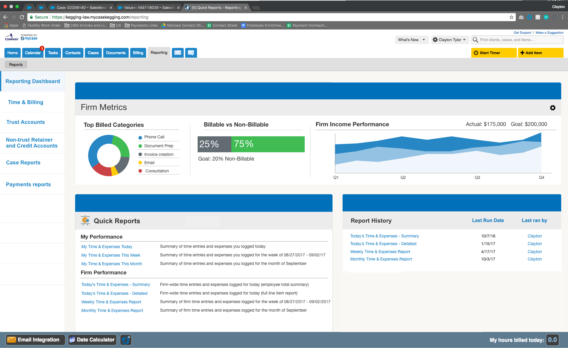
The reporting feature was designed to provide detailed metrics and information rapidly to get a glimpse on business health and financials. We observed that the service was not delivering rapid or relevant reports causing users to utilize other software to satisfy this need. How might we improve reporting so that our existing and new customers are successful using the feature? We will have achieved this when we see a reduction in case volume and a visible increase in report interaction.


Opportunity

By improving the local navigation and highlighting reports to show most useful items first we can hopefully boost overall adoption and usage of the feature. We validated the need for this change through customer feedback seen in surveys and in the suggestion box in the app. The goal is to increase product stickiness by offering a feature that they could not find elsewhere.

Approach

I began by creating a list of most used reports from the usage metrics I have available to me. From there I want to identify a workflow that users have when using reports do they run report a and report b after? Using Mixpanel and Pendo to collect this data and create funnels to see where users dropped off when using reports. Once I had identified the usage of reporting feature and the functionality available with our integrations I began sketching out ideas.

Next Steps

Recruiting users to begin testing and validating my initial ideas to impliment a dashboard. Competitive research shows that users are asking for it, but do they also want the ability to have goal setting for users and themselves in app?


Problem Statement

Reporting was designed to achieve detailed yet rapid metrics on firm health and financials. We have observed that the product isn’t meeting the goal of delivering rapid metrics, which is causing users to utilize other reporting software reducing overall adoption of the working aspects of reporting causing an increase in cases on the front facing teams. How might we improve reporting so that our customers are more successful based on reduction in case volume and increase in report interaction?


Hypothesis

We believe a reporting dashboard and customizable firm metrics along with a reorganized reporting tab will boost feature adoption and increase customer satisfaction. We will know we’re right when we see interaction metrics with reporting increase and case volume marked as reporting decreases.


Research

This project started as a small quick win to reorganize the reporting tab dropdown to show more reports instead of different quick filters of the same two reports. There is space for 8 different reports and it is being utilized for 4 at this time. I began by looking in Pendo, which we use to track clicks and feature usage to see what reports get the most traffic. Unsurprising, the 4 reports listed get a good amount of traffic. However, some reports that are not on the dropdown are used the most. Why make the user have to go to another page to view their most used report when it could be one click away?

While researching this project I kept coming across users asking for a more robust reporting feature and wanting the ability to set actionable goals for themselves. Many users quoted features that our competitors already offer. I expanded this project from to include the construction of a new reporting dashboard and a redesign of the feature as it has not been updated to our new style.

Once I had the idea fleshed out of what users wanted I began doing competitive research to see how they handle their reporting and if they offer a dashboard with goal setting. To my surprise, many of them did not yet offer this feature but integrated with software that satisfied that need. I collaborated with our customer support team to see what information they hear users asking to see on their home dashboard. From there I designed graphics to quickly convey this information and set up a flow for the dashboard on how we see users interacting with reporting currently. I saw that many users will run the same report multiple times a day as they are comparing information in one to another but are not exporting them. So, by creating a recent report history they can now quickly hop into that previously run report without having to start over.


From, To & Where to Next

Building out a dashboard is a big undertaking. Defining and classifying what data is worthy of being placed on it when there is so much that a user wants to see involves a painstaking usability and validation testing process. By starting from scratch I get the pleasure of designing what I want our graphics to look like and am not forced to rely on a style guide, but this also creates more items to research and ensure they are both usable and inclusive to as many users as possible. From here I would like to expand on the metrics and include even more customization to allow users the ability to set more goals and actionable items for themselves and employees.

New Tab Dropdown

New Reporting Page


Current Tab Dropdown


Current Reporting Page