Other Projects quick wins and fun designs


Icons

I was given the opportunity to create a share icon for one of our teams. I started brainstorming out some new designs that. I ended with three versions. The first is a simplified version of our current sharing icon seen elsewhere in the app. This icon is my top choice as it maintains consistency with our what icons we use to signify certain actions. I created two other versions for the team. A version using an arrow as that is a common aspect of many share icons and another using a filled version of the share connected dots. The created icon will be implemented with a new feature being released later this year. I included a view of the icon in situ as it will be viewed in-app.
User Activation Email

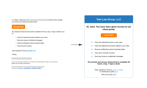
The current email sent to clients to activate their portal is unformatted text. We used to have a well-designed html based email that received feedback about being too colorful and sales-focused for clients. For that reason, they removed almost all color but the 'activate now' button. Feedback on this version was that it looks too informal and even that it looks like a scam email. I tried to find a happy medium between the two by keeping to a small color palette while changing the language so it doesn't seem sales-focused while also keeping it in a properly formatted html based email that looks professional. I have presented this new design to the Product Manager but it has not been implemented yet.


Mycase Advice Box

Collecting internal product feedback never had a home. It would be slacked, emailed, g-chated, and even written down and scanned for the product team. I approached our Director of Product and pitched the Advice box as a way to collect and store all internal product feedback, and she loved it! I expanded the project to include contact elimination suggestions for customer-facing teams and a UI improvement section where they could point out opportunities for improvment that may be minor enough to not show in user feedback. The Advice box has been a success with daily entries added.


UX Portfolio Website

I had the ambitious goal to write my own portfolio instead of using a generic template from one of the many drag-and-drop website editors. To achieve this I took the codecademy courses on HTML and CSS. I started using the Jekyll framework but quickly (or not so quickly) realized it was not a fit for what I wanted to achieve so I looked at what design challenges I could not complete using that and began searching for another. I ended up using the bootstrap framework since I am familiar with it and it is just so trendy right now! I have poured countless hours into making sure everything looks as good as possible for my coding level and designed what I felt is a great user experience.